Data Visualization

| Alice McGrath | 25 February 2025 |
Overview
- Discussion of the readings
- Reviewing examples
- What makes a good data viz?
Readings & discussion
Data X Design
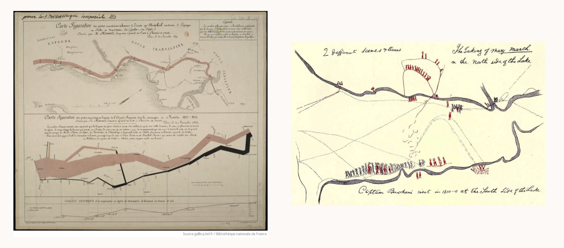
Visualzations by William Playfair (left) and Shanawdithit (right), from Data x Design, Introduction
“Introduction: A Counterhistory of Data Visulization”
- What is important about the visual & digital form of this chapter?
- Why does it matter which examples we use to tell the history of data visualization?
Data Humanism
Giorgia Lupi: “The Revolution will be Visualized”
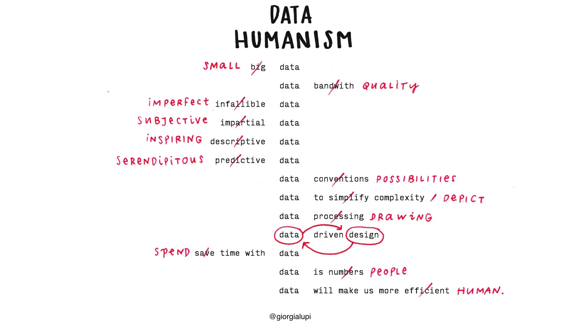
Data Humanism, a visual manifesto, by Giorgia Lupi
What makes data “human”?
What about “humanistic”?
Visualization examples
Ex. 1 Warming Stripes
Ed Hawkins, University of Reading, 2018. See also this interactive version here or read more about its growing influence
- What’s the message of this viz?
- Why is this effective?
Ex. 2: Wealth, shown to scale
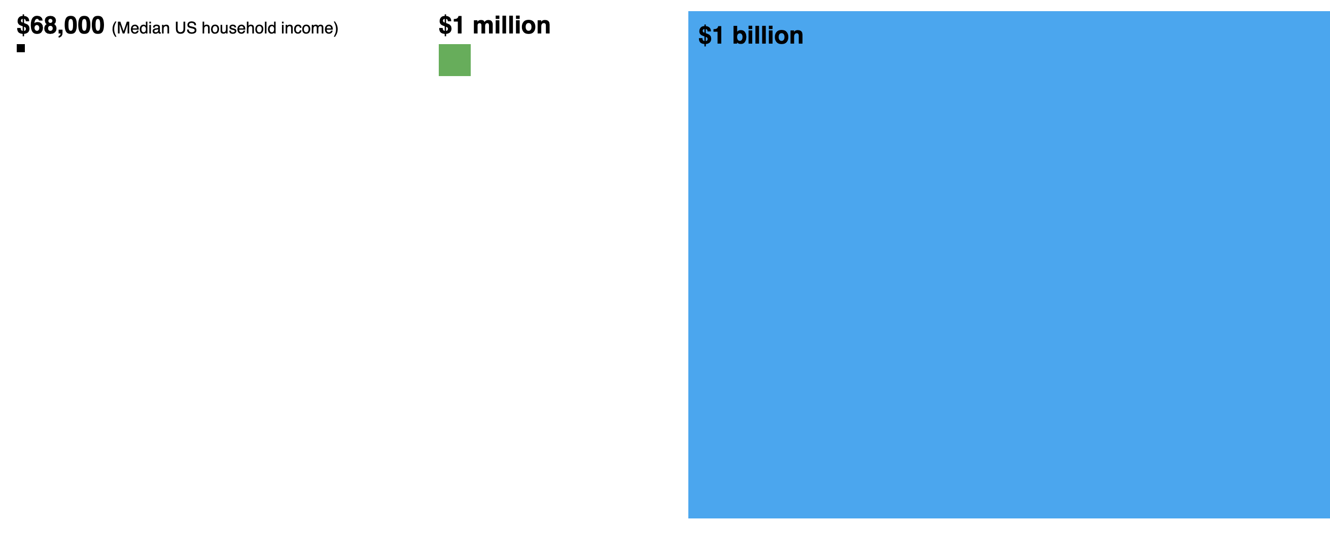
Matt Korostoff (2021); NB: the original version (MKorostoff/1-pixel-wealth) is no longer available, this adaptation by Omar A. Douglass is pretty close: Wealth To Scale, adapted for classroom. Various other translations and adaptations are available here.
Ex. 3: Dunham’s Data
Interactive Flow of Katherine Dunham’s Dancers, Drummers, and Singers (2019)
-
Read about the Dunham’s Data project: dunhamsdata.org
-
See also: “Visceral Data for Dance Histories: Katherine Dunham’s People, Places, and Pieces”, Harmony Bench and Kate Elswit, The Drama Review 66.1 (March 2022)
Ex. 4: Reach of Racism
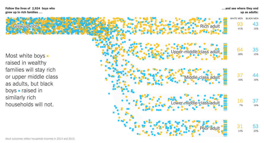
NY Times: Extensive Data Shows Punishing Reach of Racism for Black Boys (3/19/2018)
- NB: url is paywalled - see access instructions here.
- See also: more info about the study by Opportunity Insights that developed the data
W.E.B. Du Bois: Data Portraits
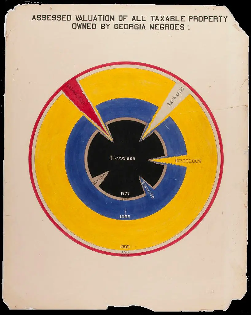
Chart from Du Bois’s 1900 “The Exhibition of American Negroes,” featured in Data by Design ch. 5
See also
- Library of Congress: Charts and graphs showing the condition of African Americans at the turn of the century exhibited at the Paris Expositions Universelle in 1900
-
Blog post about the exposition by Ellen Terrell: “Du Bois in Paris”
- Rusert and Battle-Baptiste, W.E.B. Du Bois’s data portraits: visualizing Black America (Princeton Architectural Press, 2018)
- The Du Bois Data Portrait Challenge, an effort to recreate these visualizations using contemporary tools
- See also the data on their github repository
Other examples
-
Physicalizations and Visualizations from the “Energy Afterlives” 360: in Dalton Hall and on the Scalar site
-
The Shape of Dreams (Google Trends), Federica Fragapane, 2020.
- Medium post: Visualizing the Shape of Dreams
Questions to ask
- How does it affect you? Why?
- What message is it trying to communicate?
- What questions does it raise?
What makes a good data viz?
Inspiration
- For choosing visualizations: From Data to Viz
- Dear Data project, Georgia Lupi & Stefanie Posavec
- Winners of the Information is Beautiful Awards
- Use your imagination! Draw your visualization on paper.
Correlation is not causation
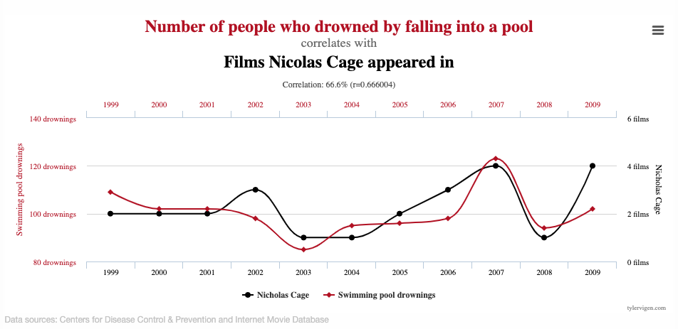
See other Spurious Correlations, by Tyler Vigen.