Data Visualization
Data Visualization

Alice McGrath | 25 February 2025
Data X Design

Visualzations by William Playfair (left) and Shanawdithit (right), from Data x Design, Introduction
“Introduction: A Counterhistory of Data Visulization”
- What is important about the visual & digital form of this chapter?
- Why does it matter which examples we use to tell the history of data visualization?
Data Humanism
Giorgia Lupi: “The Revolution will be Visualized”
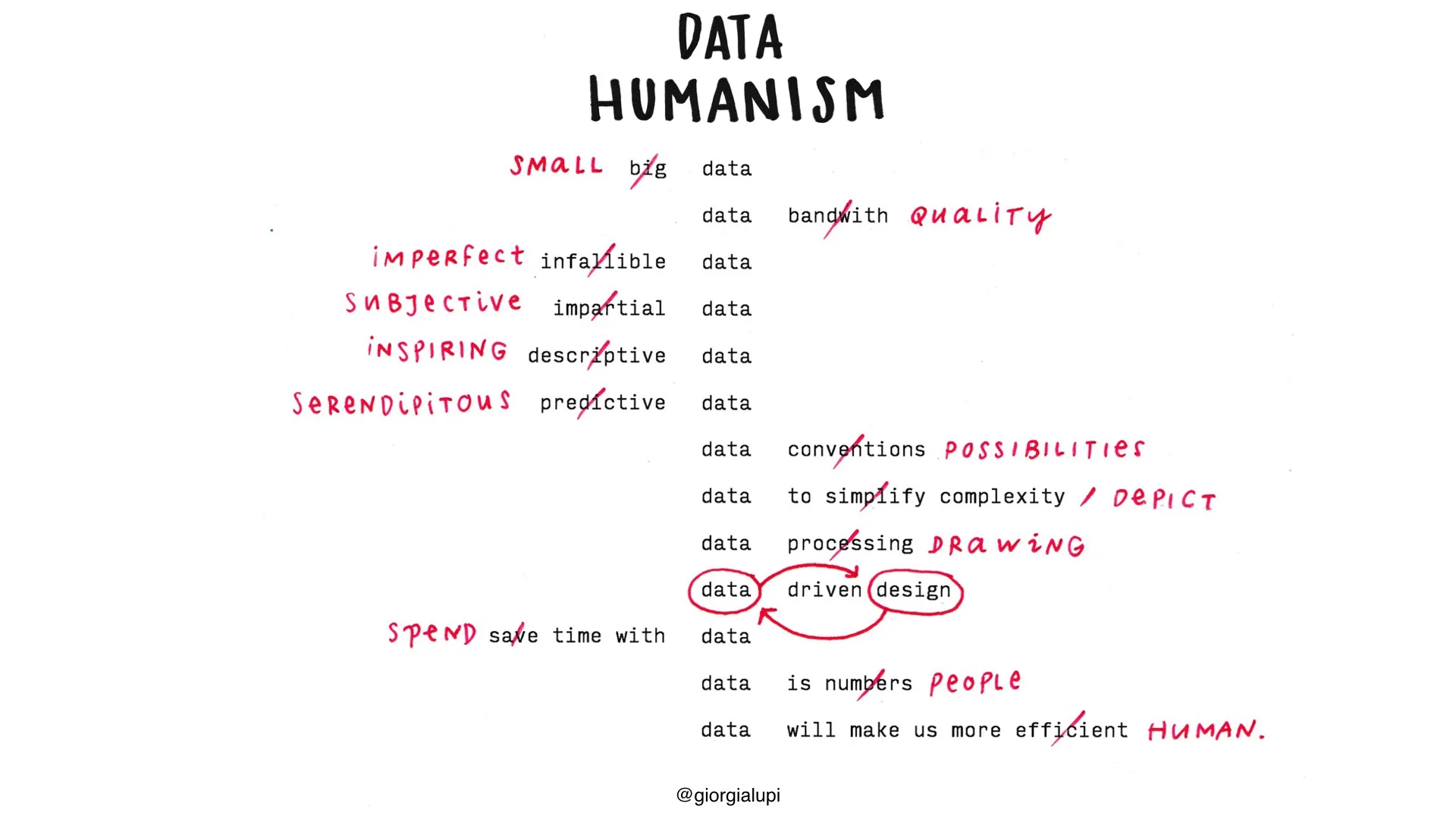
Data Humanism, a visual manifesto, by Giorgia Lupi
What makes data “human”?
What about “humanistic”?
Ex. 1 Warming Stripes
Ed Hawkins, University of Reading, 2018. See also this interactive version here or read more about its growing influence
Ex. 2: Wealth, shown to scale
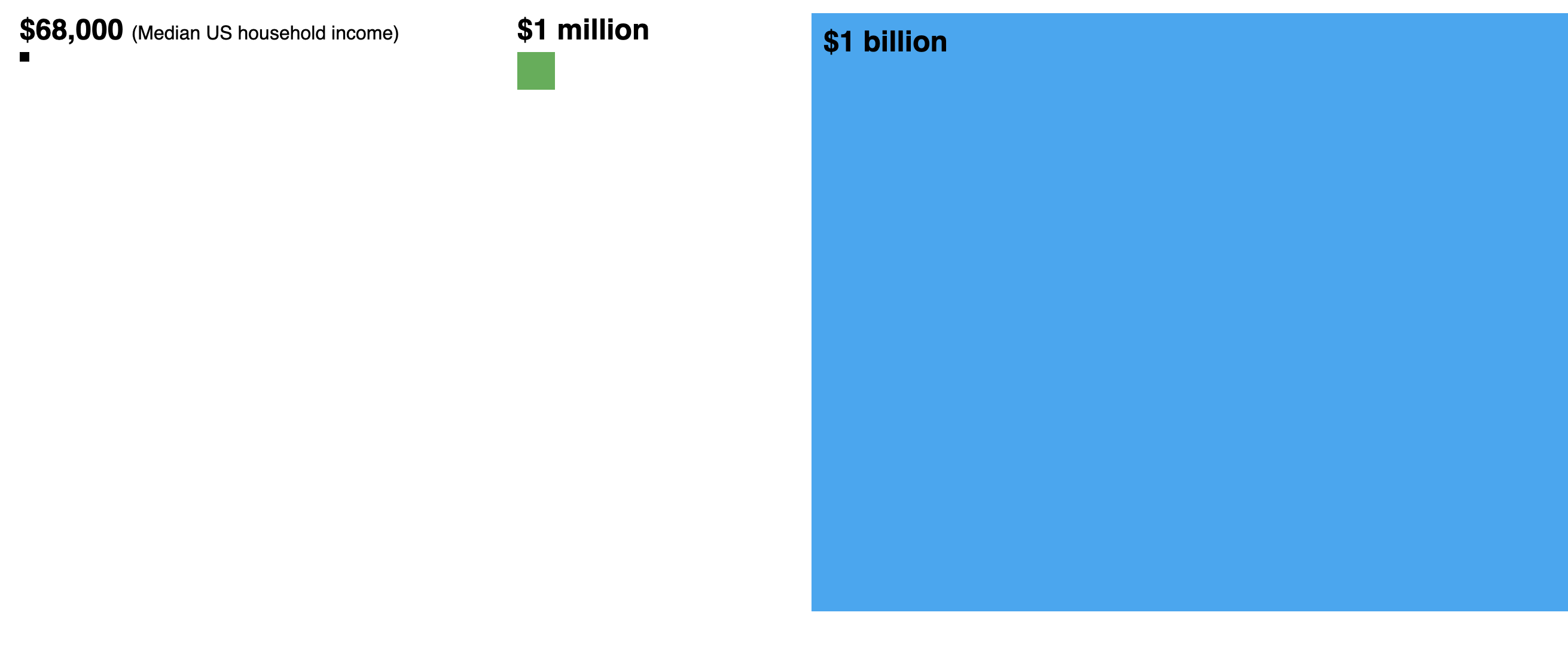
Matt Korostoff (2021); NB: the original version (MKorostoff/1-pixel-wealth) is no longer available, this adaptation by Omar A. Douglass is pretty close: Wealth To Scale, adapted for classroom. Various other translations and adaptations are available here.
Ex. 4: Reach of Racism
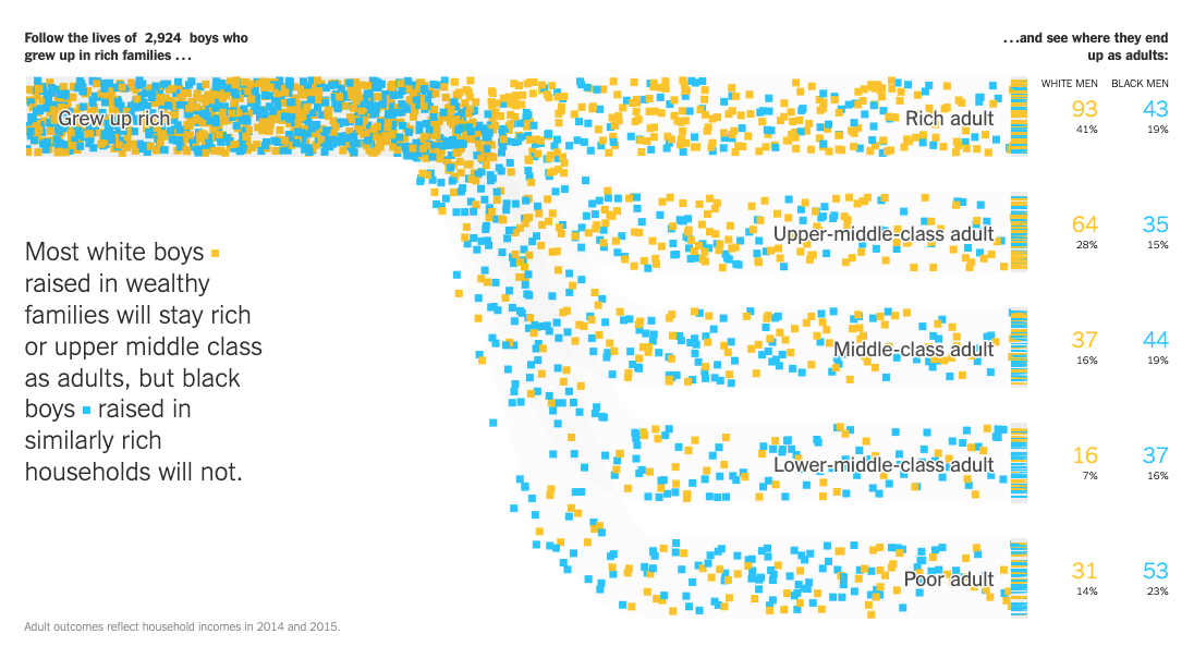
NY Times: Extensive Data Shows Punishing Reach of Racism for Black Boys (3/19/2018)
W.E.B. Du Bois: Data Portraits

Chart from Du Bois’s 1900 “The Exhibition of American Negroes,” featured in Data by Design ch. 5
See also
Library of Congress: Charts and graphs showing the condition of African Americans at the turn of the century exhibited at the Paris Expositions Universelle in 1900
Blog post about the exposition by Ellen Terrell: “Du Bois in Paris”
Rusert and Battle-Baptiste, W.E.B. Du Bois’s data portraits: visualizing Black America (Princeton Architectural Press, 2018)
The Du Bois Data Portrait Challenge, an effort to recreate these visualizations using contemporary tools
See also the data on their github repository
Correlation is not causation
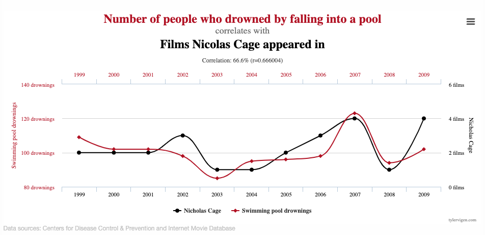
See other Spurious Correlations, by Tyler Vigen.